Tan Sip Khoon User Experience Designer
Flights Search Results
ZUJI flights business declined because of the platform change in 2013. After investigating, we proposed some design improvements to the flights search results that enable users to find their flights faster.
ZUJI flights business declined because of the platform change in 2013. After investigating the issues, we proposed some design changes to the flights search results that enable users to find their flights faster.
Problem
ZUJI is an award winning online travel agency (OTA) in Asia Pacific. In 2013, after being acquired by Webjet—the largest OTA in Australia and New Zealand—ZUJI switched its booking engine to use Webjet’s platform. The platform switch had caused ZUJI to suffer a huge drop in the booking conversion rate.
As the user experience designer, I worked with Head of Customer Experience to identify the problems and came up with solutions to rectify them.
Problem 1 – Difficulty in the Discovery of Flight Options
During the interviews, business stakeholders felt that the new booking platform had fewer flight options. We also found out test participants had problems in finding the flights they wanted from the usability tests.
Upon close inspection on the usability test videos, we discovered there were 2 main usability issues on the flights search results page:
- The airline ribbon on the top was defaulted to the cheapest airline. Some test participants could not find their preferred airline because they skipped the airline ribbon.
- The search results filters had higher visual hierarchy than the results content. This also caused some test participants to skip the airline ribbon and went straight to the filters.
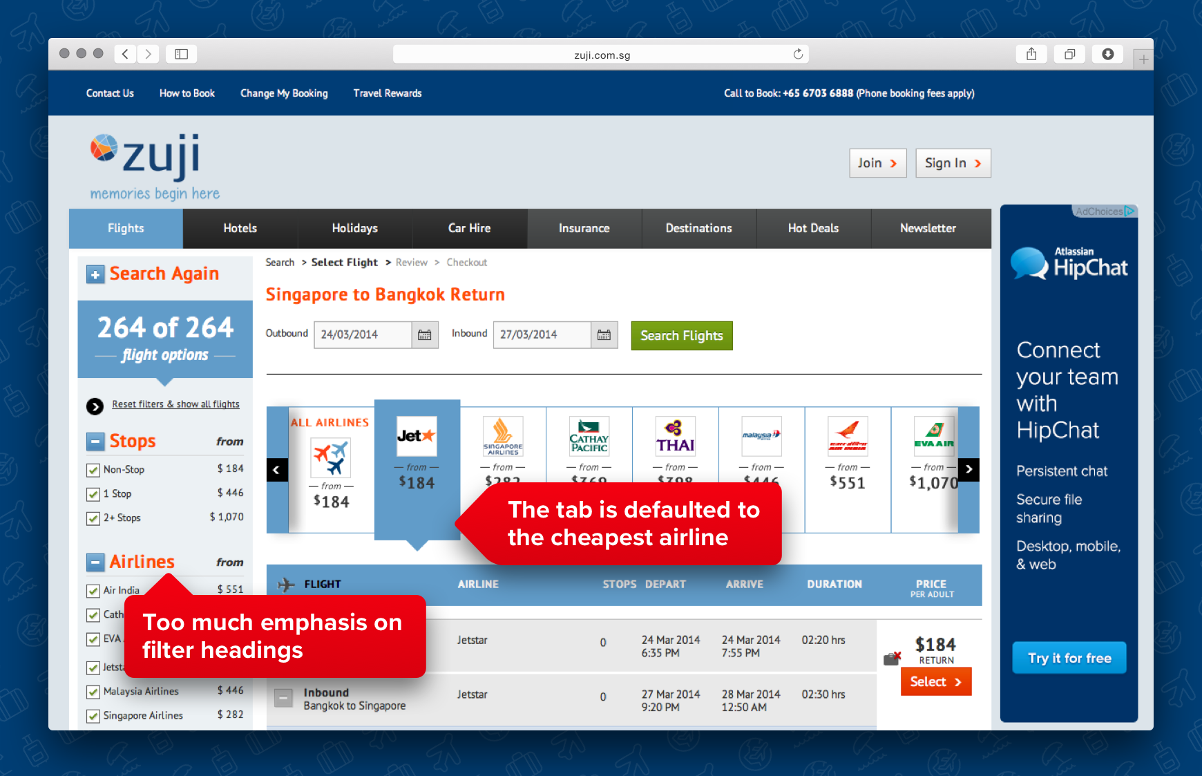
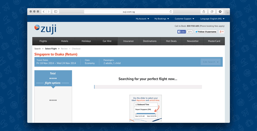
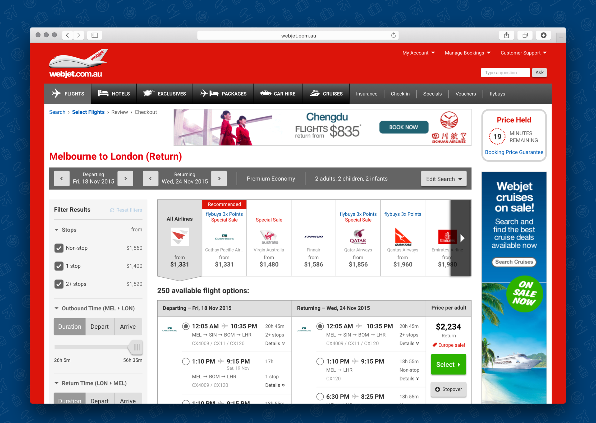
Flights search results page in 2013. The airline was defaulted to the cheapest airline (Jetstar in the screenshot) and the filter options on the left hand side stole the attention away from the flight options content.
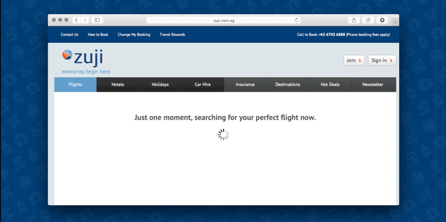
Problem 2 - Slow in Flights Searches
All the usability test participants voiced their frustration over the long waiting time to retrieve the flights search results. On average, users had to stare at the spinning gif icon on the intermediate page for 16 seconds while waiting for the flights search results.
Solution
Quick Solutions to the Usability Issues
- Changed the airline ribbon default from the cheapest airline to “All Airlines”.
- Reduced the visual hierarchy of the filters section by reducing the heading font size and number of colours used.
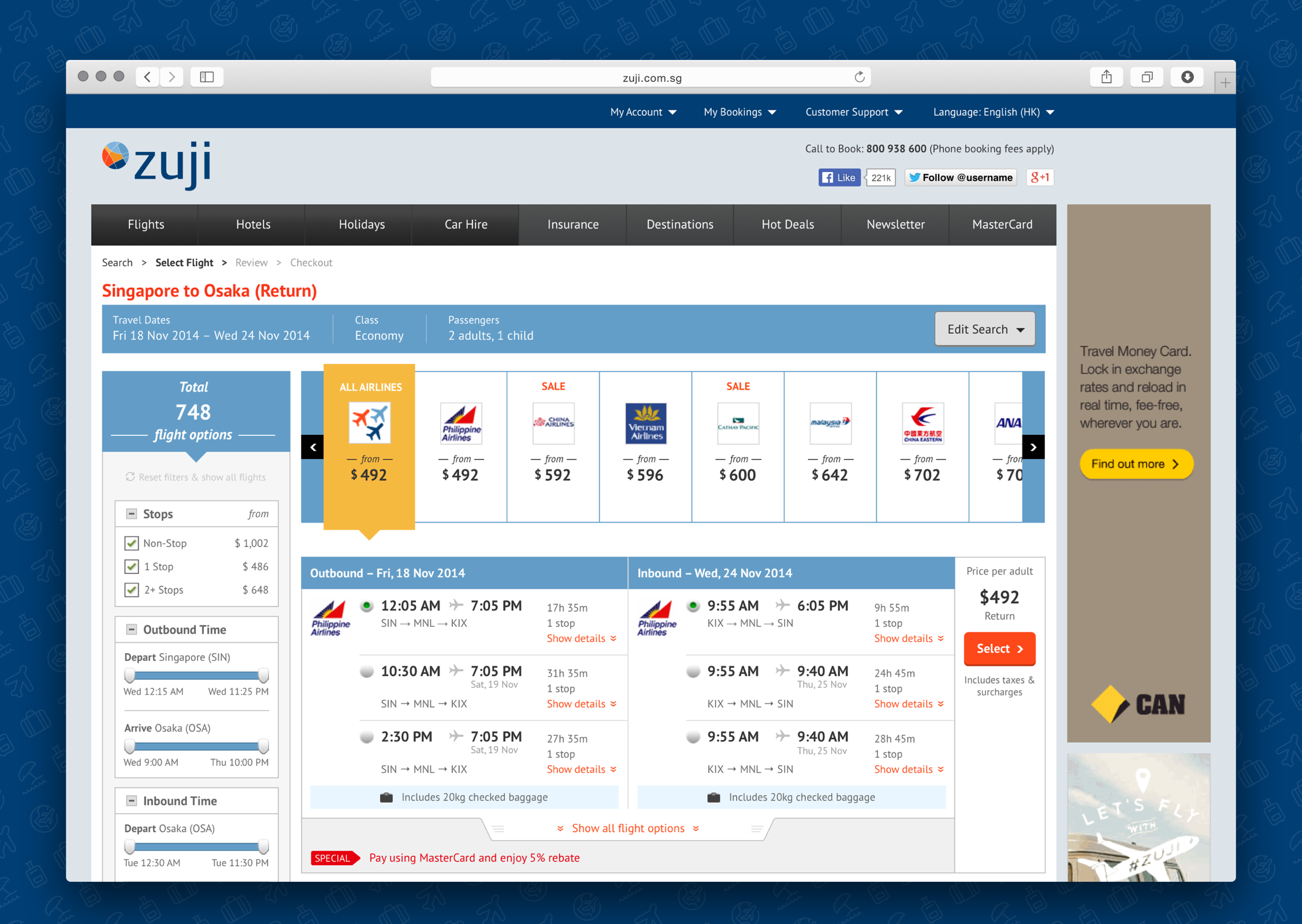
Designing for Return Flights Options
Due to the lack of domestic air travel, city states like Singapore and Hong Kong (ZUJI’s main markets), the air travel needs are different from other international markets such as Australia, United States and China. For travellers in ZUJI markets, the main trip type is return flights, which flying outbound and inbound with the same airline is cheaper than flying with two different airlines (except for low cost carriers, like Jetstar, Scoot and AirAsia).
International OTAs like Webjet and Expedia, they present the flight options in 2-step—a list of all outbound flights and a second list of all inbound flights. 2-step selection process is suitable for the domestic air travel markets, where travellers can combine any outbound flight with any inbound flight without costing more. In ZUJI, we grouped return flights as a pair, this matched the mental model of users booking for return flights. Each option was a pair of outbound and inbound flights that gave users a cheaper return airfare.
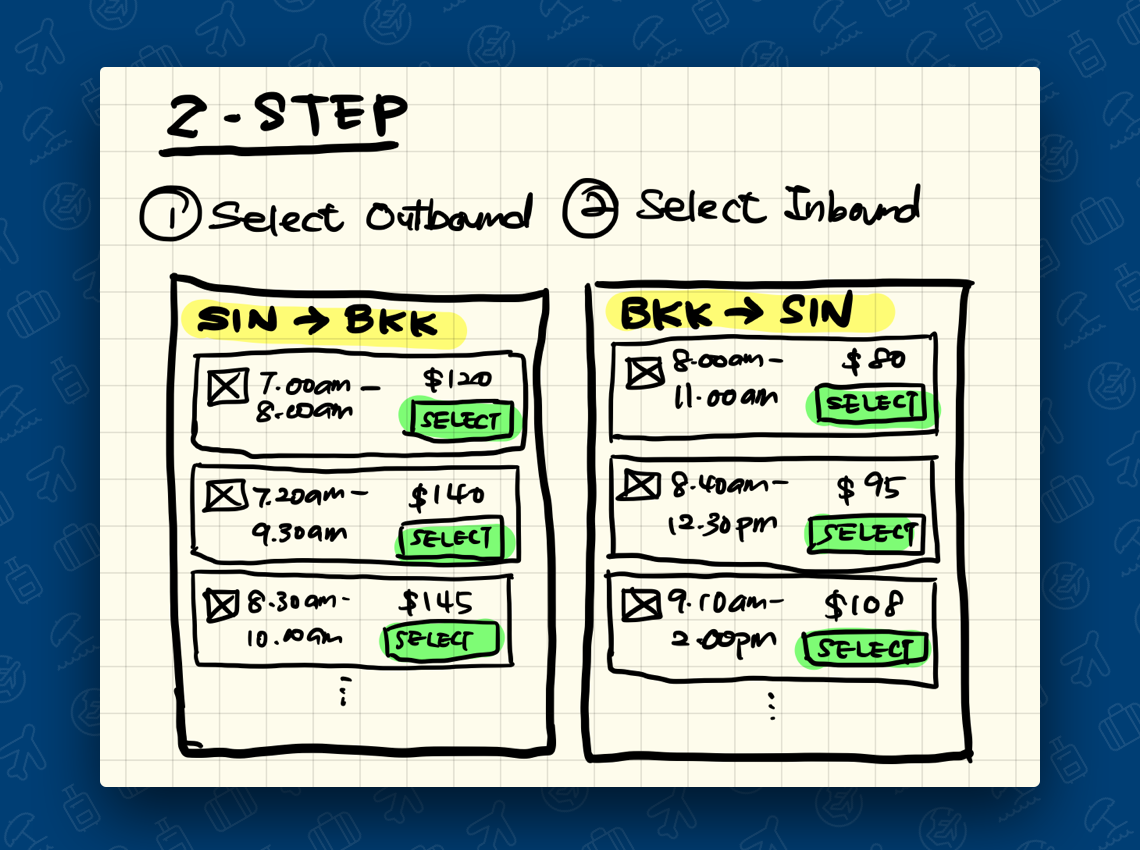
2-step flight selection process – users first select their outbound flight, then move to the next screen to select the inbound flight.
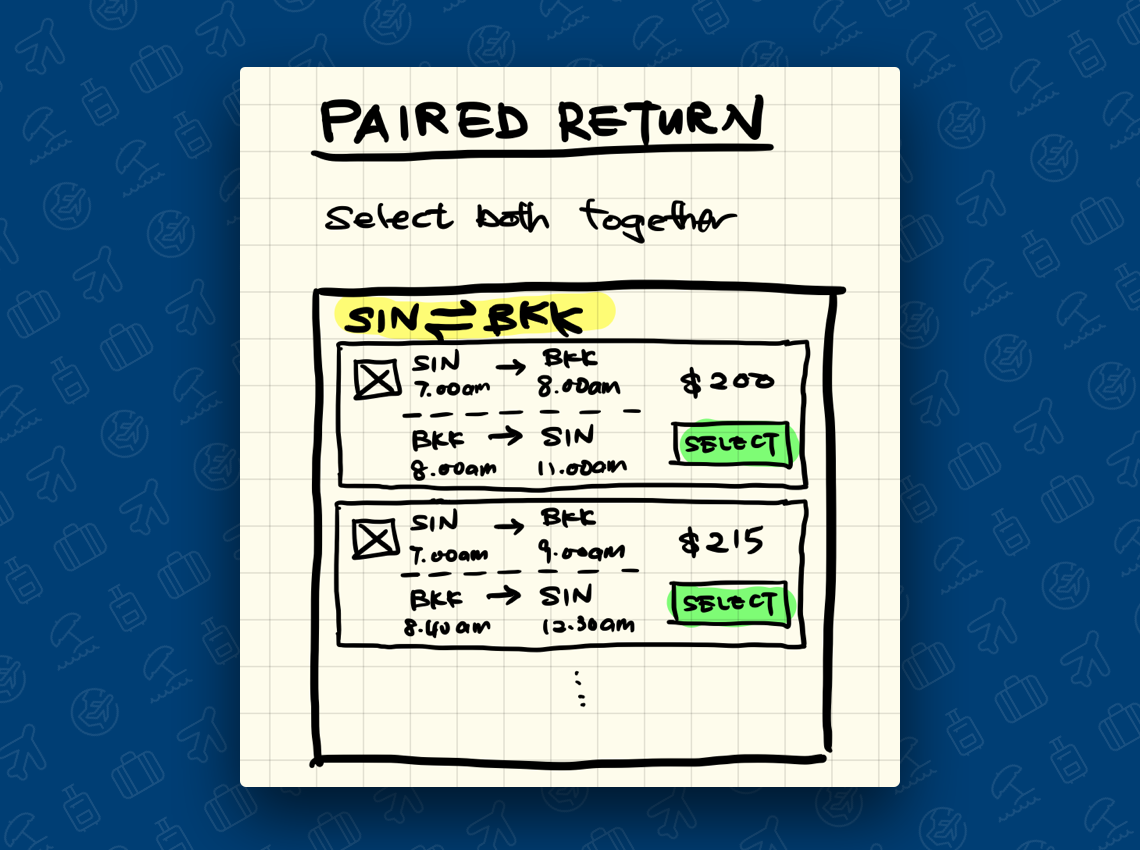
Unlike the 2-step process, users can make decision for both outbound and inbound flight at the same time on the paired return flights list.
But the main issue with the paired return is findability. For popular routes like Singapore ⇄ Bangkok, there could be more than 700 flight options to choose from. With different combinations between outbound and inbound flights, the search results could have over 20 flight options for just an airline at a specific airfare. Users had to scroll through a long page or to carefully fine tune the filters to find the suitable flights.
In order to make it easier for users to browser through the flights search results, we grouped return flight options with the same airfare and same airline into a single card. This reduced the flights options from a few hundreds to just over a hundred.
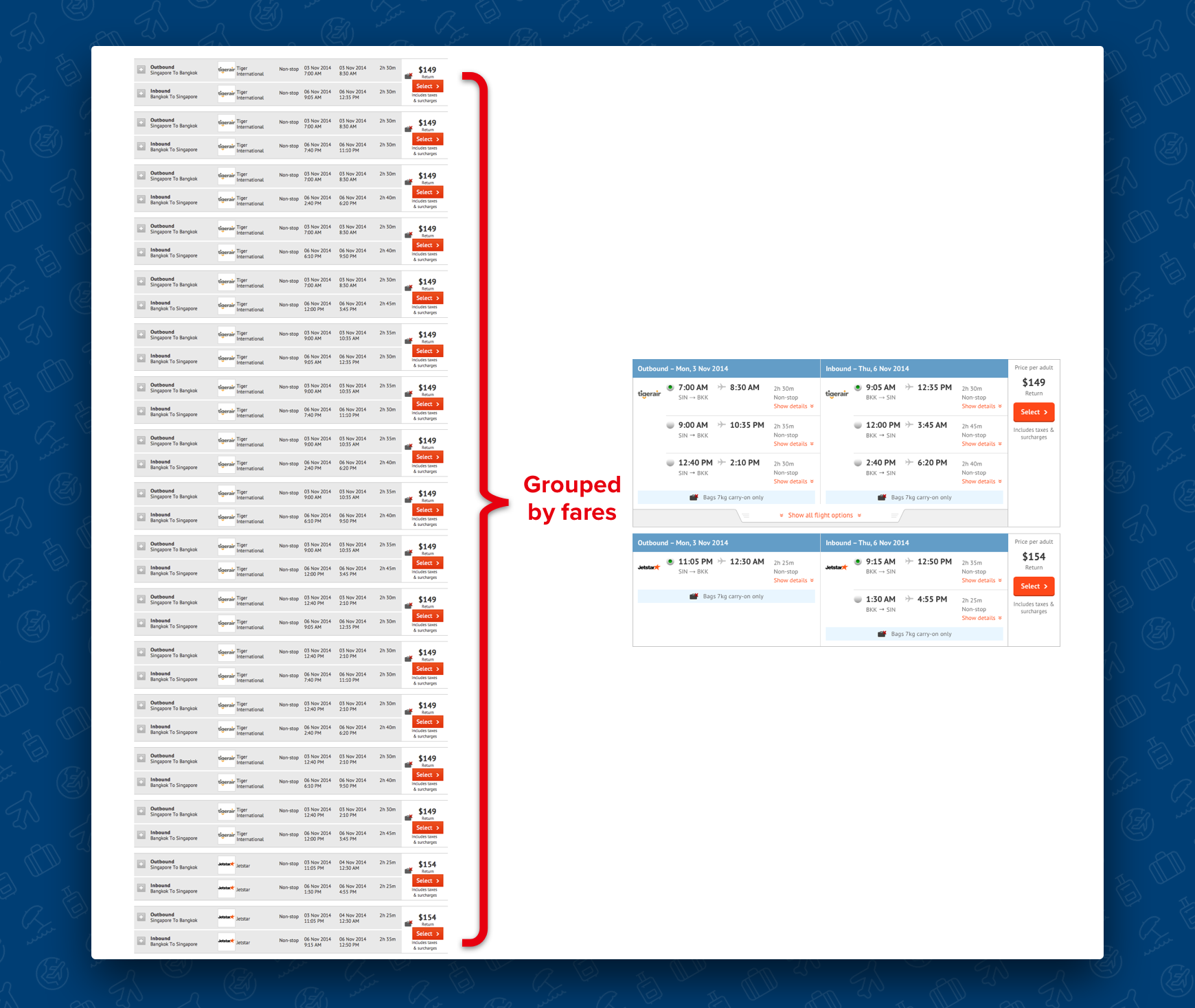
A long list of paired return flight options can be grouped by fares and reduced to fewer options.
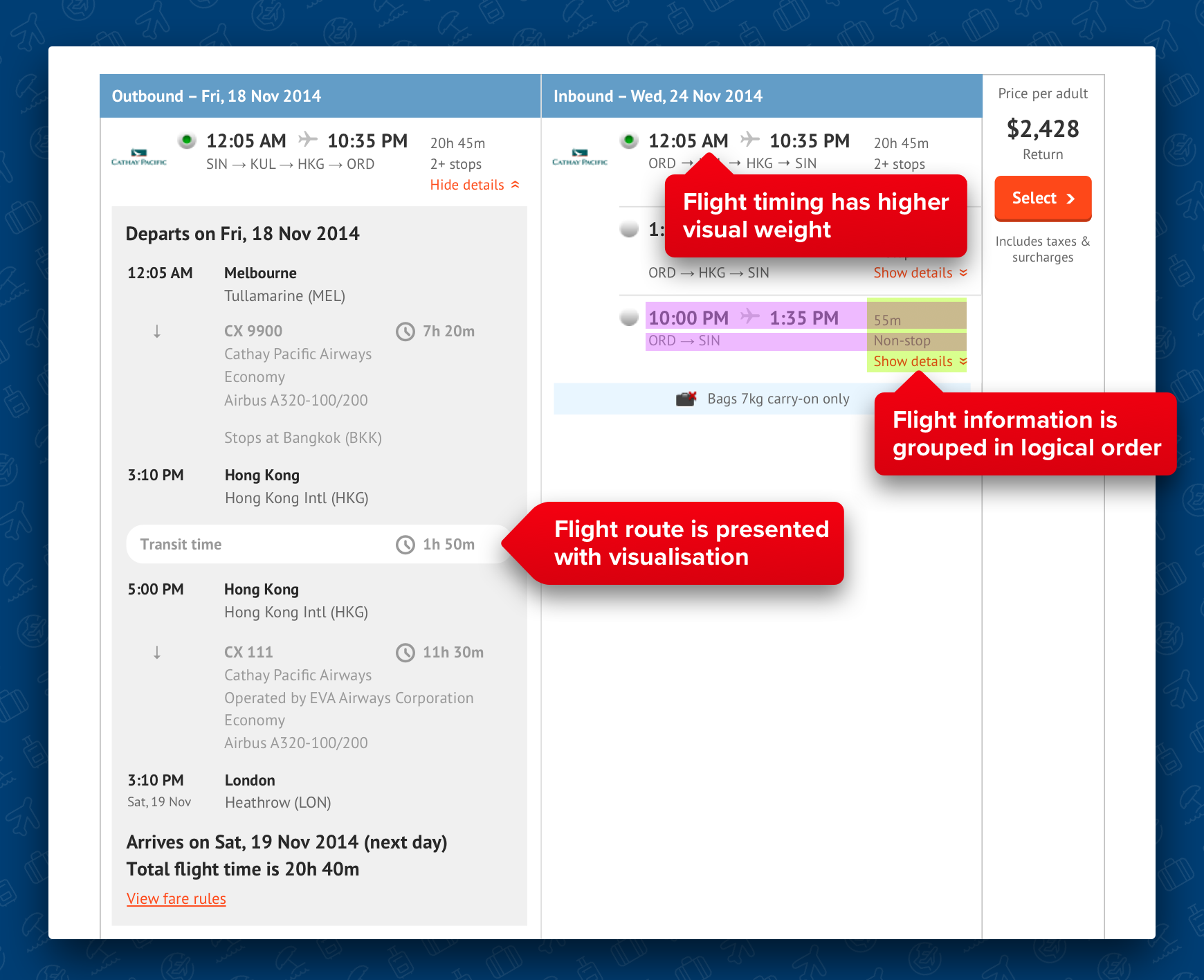
We also discovered a few user interface issues during the cognitive walkthrough session. The flight information's visual hierarchy was flat. Flight timing, duration, origin and destination were all presented with same visual weight. We increased visual weight to the flight timing to make it clear to users that within the same air fare, flight timing is the main difference between the flight options. We rearranged the flight information to present it in a logical format.
Making Flight Searches Faster
The bottleneck of the flight search speed is GDS (global distribution system) and API connections. For this project we didn't have the engineering resource to build a robust caching system to speed up the search speed, we resorted to interaction design for solutions to make the flight searches feel faster.
The average loading speed of flight searches is 16 seconds. From the usability tests, participants on average started to complain the searches were slow after 11 seconds. We managed to speed up the search process around 2 to 3 seconds by removing the traditional intermediate loading page and directly showed users the search results page with the available content (such as generic UI elements and search criteria) while waiting for the flight content. More importantly, it created the perception that the flight searches page was loading faster.
From ZUJI to Webjet
The design was implemented over a few releases, and the final result was very positive. ZUJI’s flights booking conversion rate rebounded for over 40%. The success of the design led Webjet to decide to use it to replace international flights search in 2015. I worked with the product owner and business analysis to port the design over to Webjet and made changes to fit Australia’s market requirements.
The design has proven itself again by lifting the international flights business by 30%.